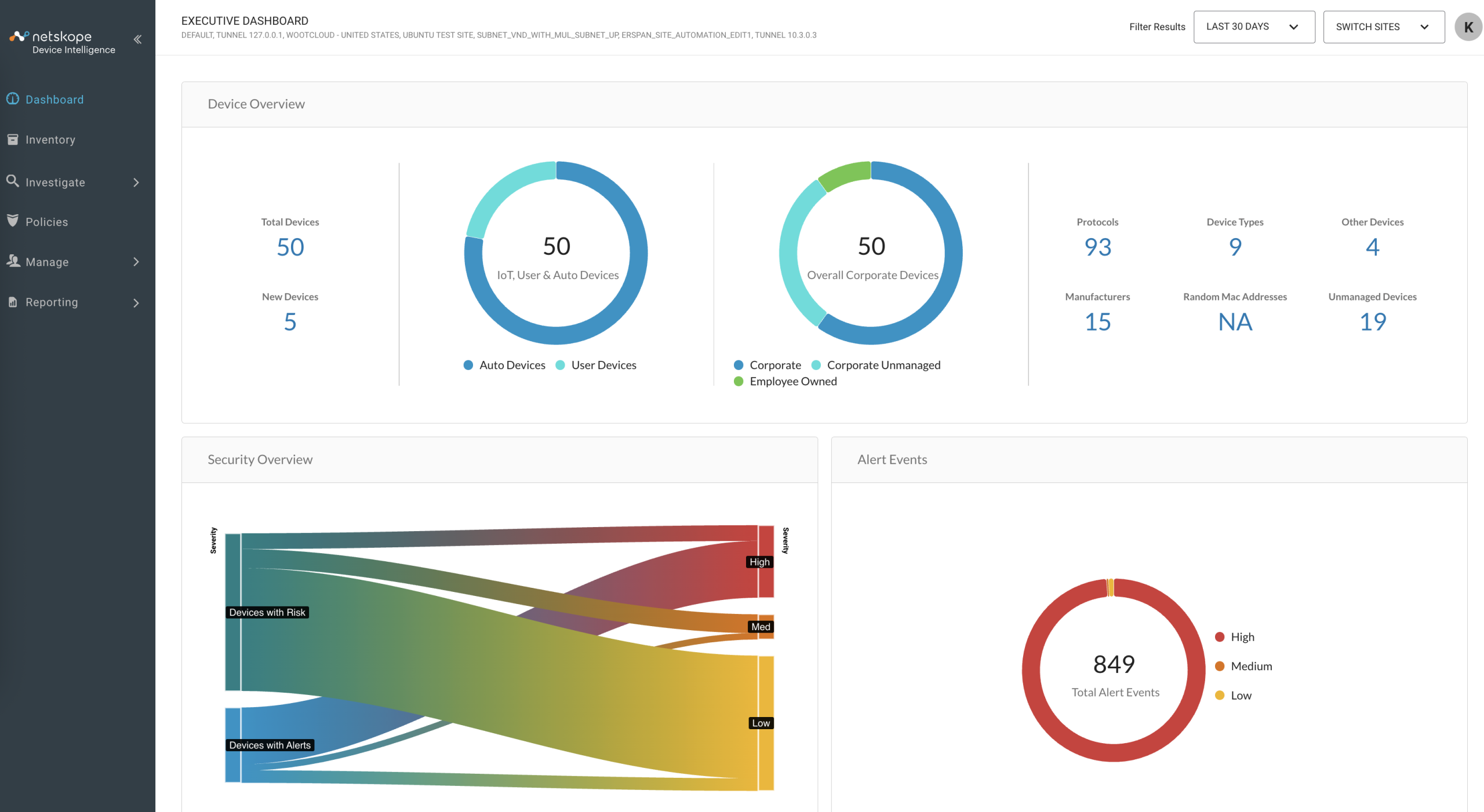
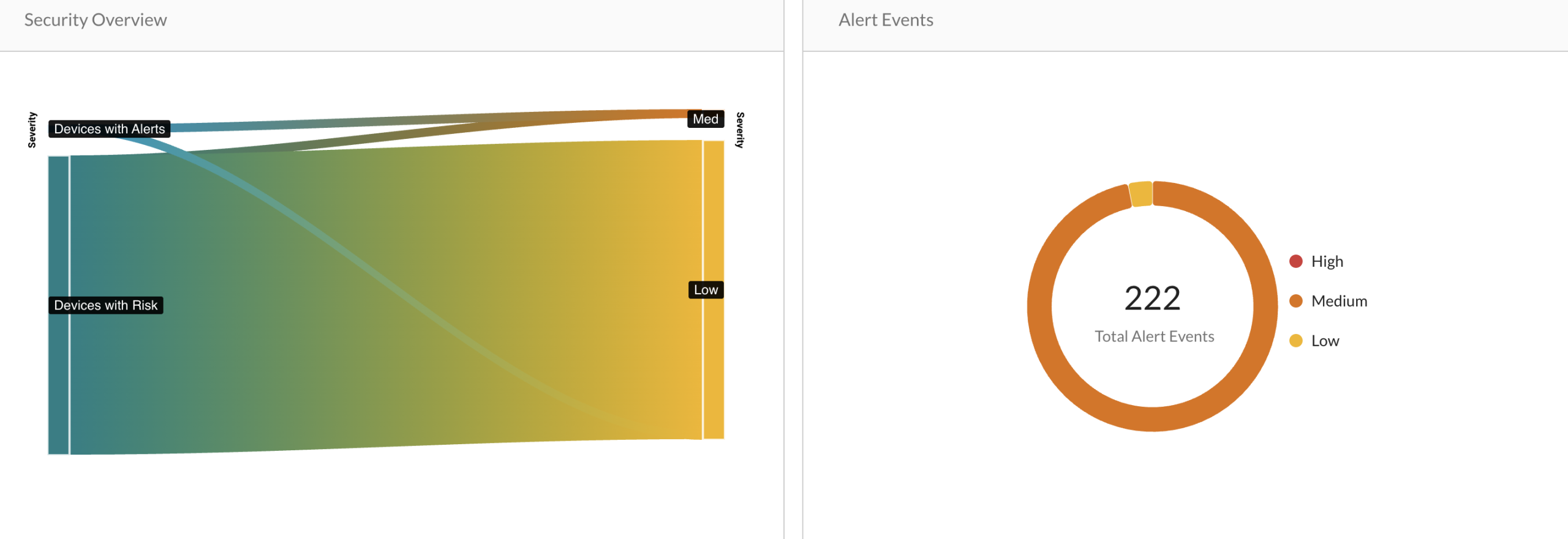
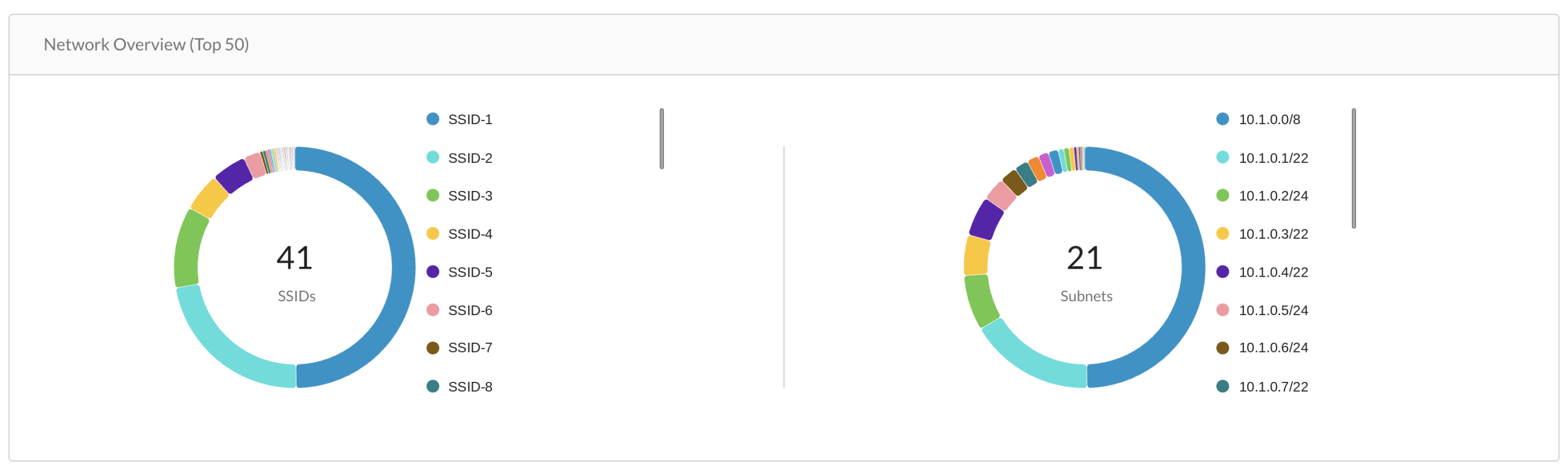
Device Intelligence offers a comprehensive suite of dashboards designed to monitor and enhance product health across various domains. The Executive Dashboard serves as the central hub, providing a high-level overview of key performance indicators (KPIs) from three specialized areas: Security, Network, and IT Operations. Each of these dashboards offers in-depth insights into their respective domains, enabling stakeholders to make informed, data-driven decisions.
In this article, we will delve into the functionalities and benefits of each dashboard, illustrating how they collectively contribute to a holistic understanding of your product’s health.

Security Operations [SEC Ops]
-
Devices with Alerts: Alerts are notifications or warnings for applications running on the machine. The chart shows the number of devices with high/medium/low severity alerts for the last 30 days. It also shows the increase and decrease of devices in that severity in percentage. For example, 31 devices had the highest number of high severity alerts and 3% improvement in the alerts.
-
Devices with Risks: Risk is the possibility of threat in the environment, like using a malicious software. The chart shows the number of devices with high/medium/low severity risk for the last 30 days. For example, 32 devices showed the high severity risks in the last 30 days.
-
Alerts Trend: The line chart shows the number of different severity alerts generated for a specific timestamp. For example, on 18 November, statistics report that 206 high severity alerts, 2 medium severity alerts and 0 low severity alerts were generated.
-
Security dashboard: Click on the “View More” button to navigate to the Security dashboard. You can see the detailed drilled down information of the alerts and risks on your devices.
Risk AssessmentAlert AssessmentAnomaly AssessmentPolicy ViolationYou can see the number of devices with high, medium and low risks in the left pane of the dashboard. The pie chart shows the distinct threat categories distributed among the number of devices affected by it. The list below the pie chart shows the distinct threat categories with the number of devices in front of it. For example, 2 general low proority threats are detected.

Risk per type in Security Dashboard Further, the risks are broken down depending on types of devices like computer, tablets, phones, etc. and tags of the devices like network, personal, etc.

Risk per tag in Security Dashboard You can see the number of devices with high, medium and low alerts in the right pane of the software dashboard. The pie chart shows the distinct alert categories distributed among the number of devices affected by it. The list below the pie chart shows the distinct alert categories with the number of devices in front of it. For example, 10 devices have an ET INFO session traversal alerts.

Alert per Type in Security Dashboard Further, the chart shows the granular alert information depending on types of devices like computer, tablets, phones, etc. and tags of the devices like network, personal, etc.

Alert per Tag in Security Dashboard The pie chart shows the distinct anomaly categories distributed among the number of devices affected by it. The list below the pie chart shows the distinct threat categories with the number of devices in front of it. For example, ‘Connection Anomaly’ detected 4 devices.

Anomalies per Type Security Dashboard Further, the chart shows the granular information of the anomalies depending on types of devices like computer, tablets, phones, etc. and tags of the devices like network, personal, etc.

Anomalies per Tag Security Dashboard The pie chart shows the distinct policy violation categories distributed among the number of devices affected by it. The list below the pie chart shows the distinct violation categories with the number of devices in front of it. For example, “Linux corporate devices” detected 4 devices.

Policy Violation per Type in Security Dashboard Further, the chart shows the violations depending on types of devices like computer, tablets, phones, etc. and tags of the devices like wootcloud HQ, personal, etc.

Policy Violation per Type in Security Dashboard
The chart displays various SSIDs in the environment along with their associated health risks. You can interact with the chart by selecting or deselecting SSIDs from the legend on the right, which will show or hide the corresponding data points.
Each SSID provides insights into:
- Number of High-Risk Devices: Indicates the count of devices classified as high risk.
- Percentage of Managed Devices: Shows the proportion of devices under management.
- Distinct Device Types: Displays the number of unique device types connected to the SSID.
Additionally, the chart offers information on ownership, device composition, risk levels, and implemented controls.
Example: The Live_demo_only SSID has 0 high-risk devices, 76% managed devices, and 11 distinct device types.
The subnet chart provides an overview of the health status across different subnet ranges within the network. You can interact with the chart by selecting or deselecting subnets from the legend on the right; this will toggle the visibility of each subnet’s data on the chart.
For each subnet, the chart displays:
- Number of High-Risk Devices: The count of devices identified as high risk within the subnet.
- Percentage of Managed Devices: The proportion of devices that are actively managed.
- Distinct Device Types: The variety of unique device types present.
Additionally, the chart offers insights into:
- Ownership: Indicates whether the subnet is managed internally or externally.
- Device Composition: Breakdown of devices by type.
- Risk Assessment: Evaluation of the security posture of devices.
- Control Measures: Information on implemented security controls and policies.
Example: The subnet 10.0.0.0/8 comprises 2 high risk devices, 66% managed devices, and 19 distinct device types.
IT Operations [IT Ops]
-
Mandatory Services Compliance: The chart shows the compliance state of asset management systems in the environment with the total number of devices managed by that particular asset management system. For example, Avast, Atlassian, Slack, etc. are services implied by the devices in the environment. The
Avastservice is implied on 286 managed devices, out of which all are non-compliant in the current state. -
Managed Assets: Managed assets show the graph for asset management systems which have managed devices. For example, the
Device Intelligenceasset management system has 1222 managed assets. -
Non Compliance Trend: The chart shows the number of devices non-compliant for a specific timestamp.
-
IT Ops Dashboard – Click on the “View More” button to navigate to the IT Ops dashboard. You can see the detailed drilled down information about asset management systems and compliance postures.

-
Asset Data Errors: Shows the number of devices with missing or misclassified parameters for OS, host name, manufacturer, type, and username. You can click on the individual notifications to see the detailed information of the device.
-
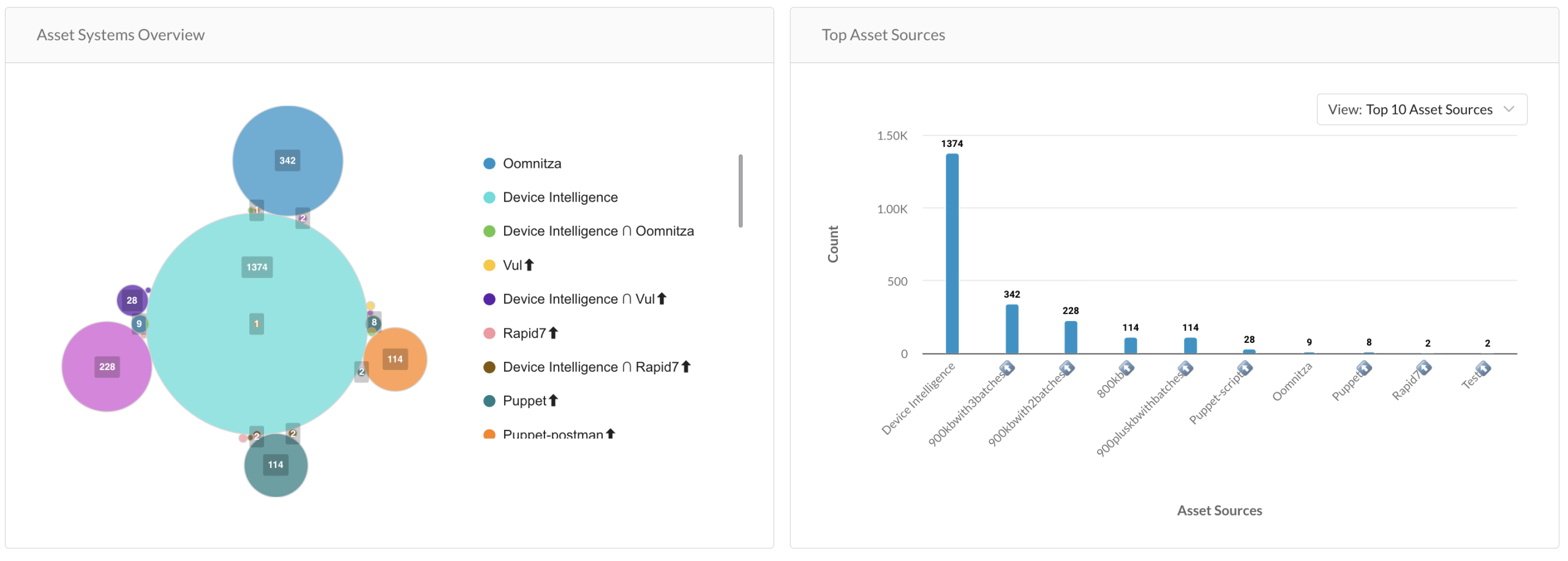
Top Asset Systems: Shows the top asset management systems with the number of devices in each system. Overlapping areas represent how many devices appear in over one system.
-
Missing Properties: Shows the number and distinct type of device with the respective missing properties. For example, a total of 629 devices are missing host name parameters.
-
Misclassified Properties: Shows the number and distinct type of device with the respective misclassified or incorrect properties. For example, total 18 devices have misclassified or incorrect host name parameter entry.
-
Compliance: Shows the compliance state of managed and unmanaged devices in the corporate environment, with the total number of devices managed by that asset management system.
-
Visibility
The Visibility section provides insights into the types and behaviors of devices connected to the network in the last 24 hours. It helps monitor device distribution across categories like connectivity type, user interaction, and management status.
The main ring chart shows the total number of devices detected in the environment over the past 24 hours. Devices are connected through Wi-Fi or wired connections. If the connection type is unknown, the device appears in a gray segment labeled “Wired or Wi-Fi.” Hover over any chart segment to view detailed data.
- User vs Automated: Displays the percentage of user-operated devices (e.g., laptops, phones) versus automated devices (e.g., sensors, cameras). A line chart shows the count of each category over time, with hourly timestamps for the last 24 hours.
- Managed vs Unmanaged: Shows the distribution of managed and unmanaged devices. Categories include:
– Managed
– Corporate Unmanaged
– Employee Owned
– Visiting
The line chart tracks the number of devices in each category across the last 24 hours. - Airspace vs Network
Indicates how devices are detected:
– Airspace – devices sensed through wireless signals.
– Network – devices seen on the wired or wireless network.
The corresponding line chart provides a 24-hour activity trend.