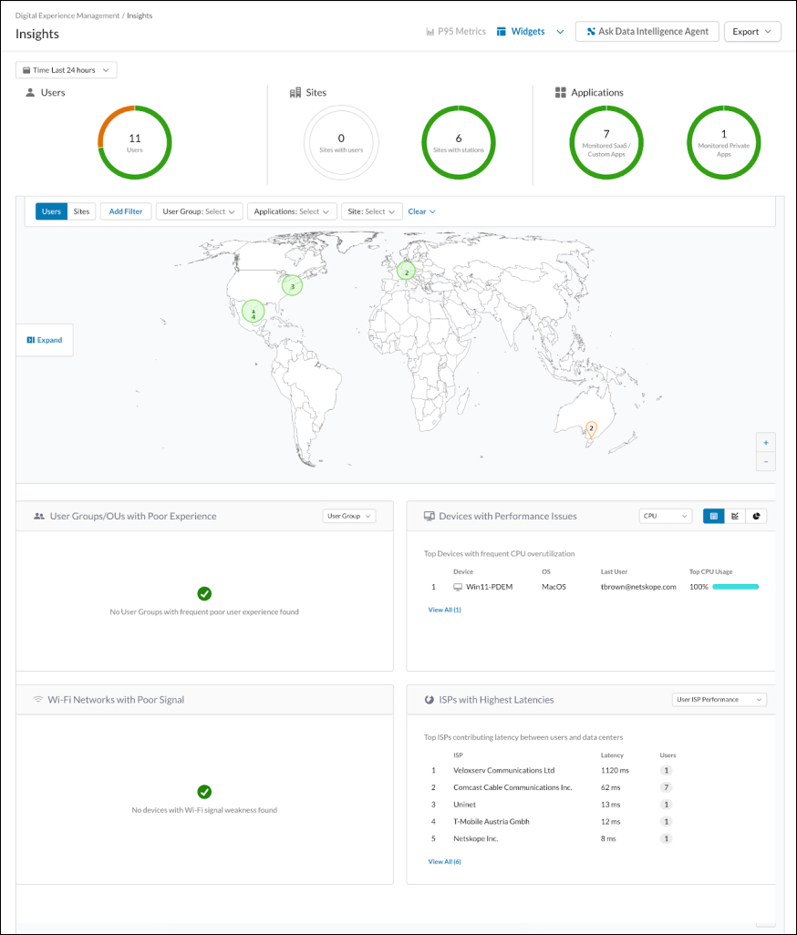
The Insights page provides a comprehensive view of digital health across your organization. It allows administrators to monitor the performance of users, sites, applications, and infrastructure from a single dashboard.
By using performance data from the Netskope Client, the Insights page helps you identify whether a performance issue is caused by a user’s device, their local Wi-Fi, an Internet Service Provider (ISP), or a specific application. Go to Digital Experience Management > Insights to view this page.
Permissions
The Insights page is RBAC-enabled. To view or manage this page, ensure your role has the appropriate permissions under Settings > Administration > Roles (or Administration & Roles for RBAC-v3) within the Digital Experience Management section.
Monitoring Overview
The metrics at the top of the page provide a total count of the elements currently being monitored by DEM:
- Users: The total number of active users observed during the selected time window.
- Sites: A breakdown of physical locations, showing sites with active users versus total sites with configured monitoring stations.
- Applications: The total number of monitored applications, categorized by SaaS/Custom apps and Private apps.
Filter Menu
The filter menu allows you to refine the data displayed on the dashboard. You can use the following filters:
- Time: Select the time range for the data. The default is the last 24 hours.
- User Group: Filter data by specific organizational groups.
- Applications: Filter by monitored SaaS or Private applications.
- Site: Filter by specific office locations.
- Clear: Remove all selected filters.
Insights Map
The map provides a geographic visualization of your environment. You can toggle the view between Users and Sites to change the focus of the data points.
The data points are represented by colored circles. The number inside the circle indicates the count of users or sites in that region. The colors represent the general health or status of those points. You can use the filter menu (User Group, Applications, Site) to further refine the data points shown on the map, allowing you to isolate specific departments or application performance by region.
Metrics
The following metrics and widgets help you identify specific bottlenecks in the digital experience.
User Groups/OUs with Poor Experience
This metric identifies if a specific department or Organizational Unit (OU) is experiencing frequent performance issues. It aggregates the experience scores of users within the same group to help you determine if a problem is systemic to a department or a specific policy.
Devices with Performance Issues
This metric monitors endpoint hardware health by tracking resource overutilization. You can use the dropdown menu in the metric header to switch between CPU or Memory data.
The widget displays the device name, the operating system, the last user, and the resource usage percentage. In the top right-hand corner of the metric box, you can choose from three different display formats to change how the data is presented. If a device shows 100% usage, it indicates that the user’s local hardware resources are exhausted, which is likely the cause of any reported slowness.
Wi-Fi Networks with Poor Signal
This metric tracks the signal strength of the wireless networks used by your devices. It identifies users who are connected to Wi-Fi access points with weak or unstable signals. This data is useful for troubleshooting connectivity issues for remote or office-based employees.
ISPs with Highest Latencies
This metric ranks Internet Service Providers (ISPs) based on the round-trip time (latency) between the user and the data center. You can use the dropdown menu in the top right-hand corner to select between User ISP Performance or Global ISP Performance.The metric displays the ISP name, the latency in milliseconds (ms), and the number of affected users. To see more data, click the View all button to open a window containing a complete list of ISPs. Within this list, you can hover over an ISP and click View on map. This action takes you to the Global Distribution Map and filters the view to show information specific to that ISP.
Export Options
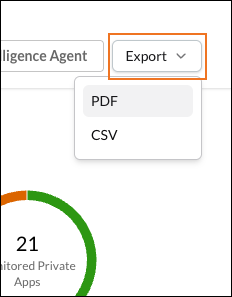
In the top-right corner of the page, click Export to download the Insights dashboard in PDF or CSV format.
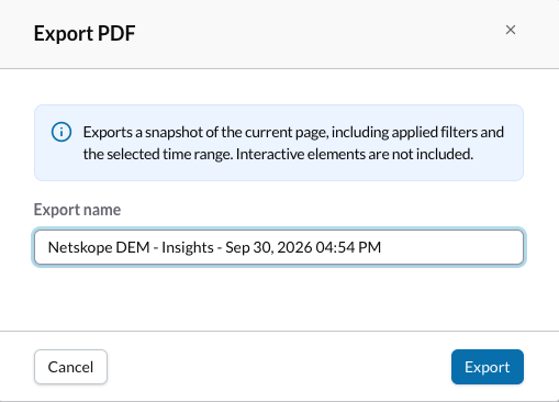
PDF: Keep or change the name, and then click Export to download the PDF file.
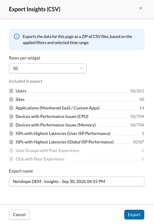
CSV: Here you see what’s included in the export. Select the number of rows to include in the file, keep or change the name, and click Export to download the CSV file.