The SaaS application metrics provide you with data on SaaS applications. You can select an application from the Monitored Applications section to view metrics for a specific application. To learn more, refer to Monitored Applications.

Important
You must select an application for the End-to-End and Application Metrics to be displayed. To learn more, please see the Monitored Applications section.
In each of the widgets on this dashboard, click the down arrow  to Export a CSV file with the data.
Connectivity to Netskope NewEdge
Tunnel Latency – Overlay
The Tunnel Latency – Overlay metric displays the latency within the tunnel between the user’s device and the POP over a selected time range. Latency is measured by sending probes every 30 seconds. The final latency values shown in the chart are based on aggregated probe results. The aggregation depends on the polling frequency configured in the system settings. If the polling frequency is set to 5 minutes, all probe results collected within each 5-minute window are aggregated to compute the latency for that window.

In addition, the Overlay represents the mean of multiple measurements collected over a time duration specified in the DEM configuration, whereas the Underlay data reflects a single measurement taken at a specific point in time.
Therefore, occasional large discrepancies between these two metrics are not a concern. However, if a consistently large gap is observed, further investigation is warranted to understand the underlying cause.
Network Path Latency – Underlay (E2E)
The Network Path Latency – Underlay (E2E) metric tracks the round-trip time (RTT) between a user’s client and a Netskope POP over the page’s selected time range measured via Traceroute.

The line chart provides several key behaviors and workflows:
- Trend Analysis: The interface displays RTT between the user’s device and netskope POP measured via Traceroute as a time series so you can easily observe performance trends over time rather than isolated measurements.
- POP Identity: Hover over any data point to view the connected POP, timestamp, RTT, and public IP address.
- Synchronized Zooming: The interface synchronizes chart behavior so that zooming into a time range in this chart simultaneously zooms the hop-by-hop view below.
- Path Analysis Transition: The tooltip includes a navigational shortcut where you can click View Hop-by-Hop to proceed to path-level analysis for the selected time window.
Network Path Latency – Underlay (Hop by Hop)
The network path visualization widget shows all network paths that were taken during the selected time period.The view aggregates all paths taken by the traceroute probes over the time period selected on the page filter into a unified hop by hop view. This view allows administrators to look at the ISP path taken to reach Netskope and its performance. The thickness of the path is determined by how many probes hit that path measured via traversal share. Traversal shares determine the likely hood of the path carrying users traffic.

Each node in the path corresponds to a router (or any network component delivering the routing service).
Each color identifies an AS (Autonomous System). In other words, this color identifies the ISP being traversed.
For each node, we identify its:
- location based on its RIR (Regional Internet Registry) registration
- AS name
- ISP name
For each node, we also provide the number of Network Probe tests that passed through it as well as its delay and packet loss.
Some consecutive nodes on a single path could be unknown. Instead of showing a line with multiple unknown nodes, they are grouped all together (hexagon icon).
The thickness of a link shows its usage. A thick line means that this path has been taken in a significant amount of Network Probe tests. On the other hand, a thin line means that the link has not been used much.
The graph is divided into three labeled sections:
- Internal Network: Hops discovered within the organization’s corporate network.
- Internet / ISP: Hops discovered across public internet infrastructure that are attributed to a specific ISP and ASN.
- Netskope Cloud: Netskope’s PoP..
Administrators can use the following interactive features to analyze path data:
- Time Slider with Location Awareness: Use the slider sitting above the hop-by-hop graph to filter the graph to a specific time segment. The slider tracks location context, meaning corporate site connections are colored and labeled with the site name, while remote connections are shown in blue and labeled Remote. Hovering over any segment displays the site name, the covered time window, and the number of probe samples collected. You can filter the view either by clicking a segment directly or by using the Site / Remote toggle switch.
- Edge (Link) Data: Hover over any edge (the line between two nodes) to see the link latency, traversal share, packet loss, and the Average, Median, and P95 latency for that hop. Edge thickness is proportional to traversal share, which makes dominant routes immediately visible.
- Traversal share is calculated as the percentage of probes that went through a link as compared to the total probes that were sent.
- Node Data: Hover over any node (router/hop) to view its IP address, traversal share percentage, and RTT to this node from the client measured via Traceroute probes. For internet-segment nodes, the tooltip also shows ISP, ASN, and geographic information. Nodes that did not respond to probes display a distinct visual indicator, and their tooltip shows the total count of unresponsive nodes at that position alongside their combined traversal share.
- Traversal share is calculated as the percentage of probes that went through a node as compared to the total probes that were sent.
- Latency Metric Selector: Use the metric toggle switch in the top right to change which latency value displays on the edge labels. You can choose between Average (arithmetic mean), Median (the midpoint value), and P95 (the 95th percentile representing near-worst-case conditions).
- ISP / ASN Legend: Review the dedicated legend panel to quickly identify the ISPs and Autonomous Systems present in the internet segment of the path, making it easy to attribute latency to specific network operators.
- Full-Screen Mode: Click the Full Screen button in the top right to expand the hop-by-hop view, which is especially useful for detailed analysis of paths with many hops or multiple parallel routes.
Total Connectivity Time
The Total Connectivity Time metric provides detailed information about the whole process of connecting the NSClient to the Netskope POP. You can hover over a data point on the chart to view information about the DNS resolution time, TCP Connection time, and TLS Handshake time.

This metric is only available for DEM Enterprise customers and app probes must be configured. To learn more, please see Digital Experience Management Enterprise and App Probes.
End-to-End Metrics
Time to First Byte, Time to Last Byte
The Time to First Byte (TTFB) corresponds to the time between the NSClient sending the HTTPS request (aka first byte of the request is sent) and when it receives the first byte of data payload (also called the response). The Time to Last Byte (TTLB) corresponds to the time between the NSClient sending the HTTPS request and when it receives the last byte of data payload.

This metric is only available for DEM Enterprise customers. To learn more about DEM Enterprise, please see Digital Experience Management Enterprise.
Total Response Time
The Total Response Time corresponds to the total duration of the App Probe test. It simulates the exact time for a transaction to complete.

Device Performance and Health Metrics
CPU Usage
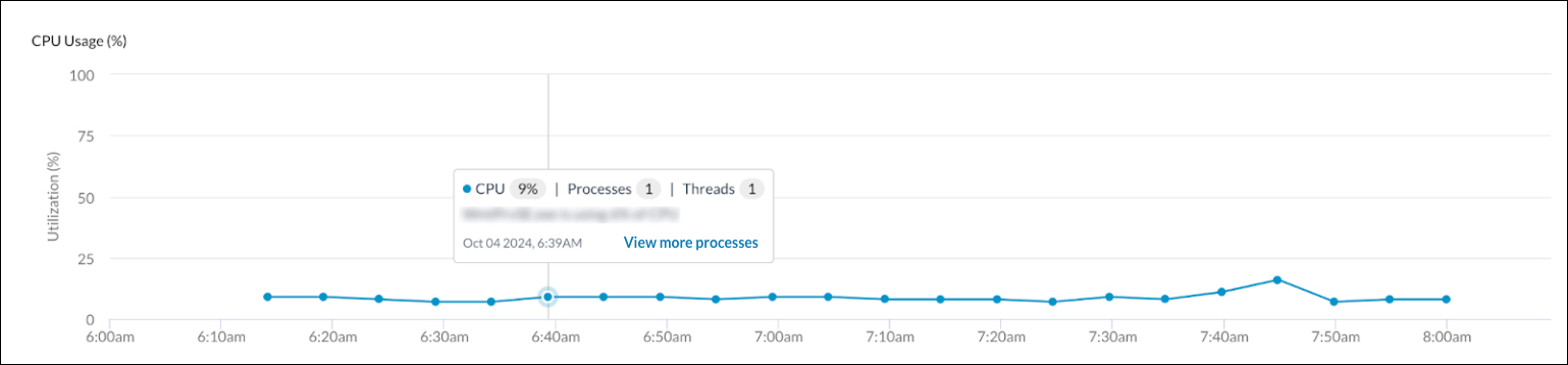
The CPU Usage metric displays the observed CPU Usage in the set time range for the selected user and device. You can hover over the time data points to view more detailed information about the CPU, processes, and threads. You can also click View more processes to view additional information, to learn more, please see the Process Info section.
Memory Usage
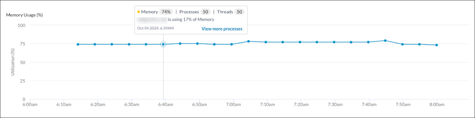
The Memory Usage metric displays the observed memory usage in the set time range for the selected user and device. You can hover over the time data points to view more detailed information about the memory, processes, and threads. You can also click View more processes to view additional information, to learn more, please see the Process Info section.
Disk Usage
The Disk Usage metric displays information about the disk usage of the selected user and device for the set time range. To view the disk usage percentage at a selected time, hover over the associated data point.

Process Info
The Processes window provides additional details about processes with greater than 1% of utilization. To open the Processes window for a specific timestamp, do the following:
- Select a set timestamp by hovering over the corresponding data point on the CPU Usage, Memory Usage, or Disk Usage metric.
- A box of data will appear when you hover over a timestamp.
- Click the View more processes button.
- The Processes window will open.
- View information for the selected timestamp by clicking on the following tabs:
- CPU: This tab displays a list of the process, CPU %, threads, and process ID.
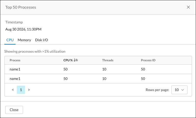
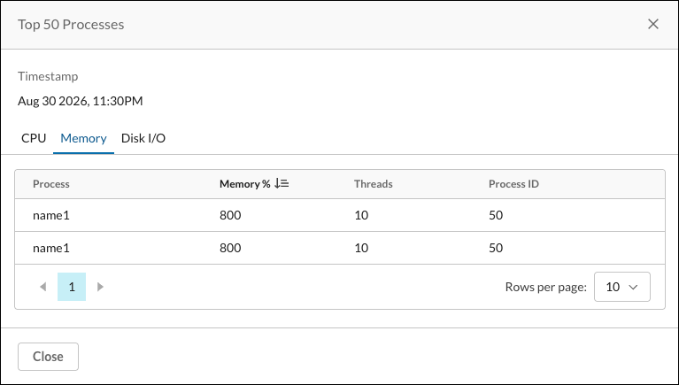
- Memory: This tab displays a list of the process, memory %, threads, and process ID.
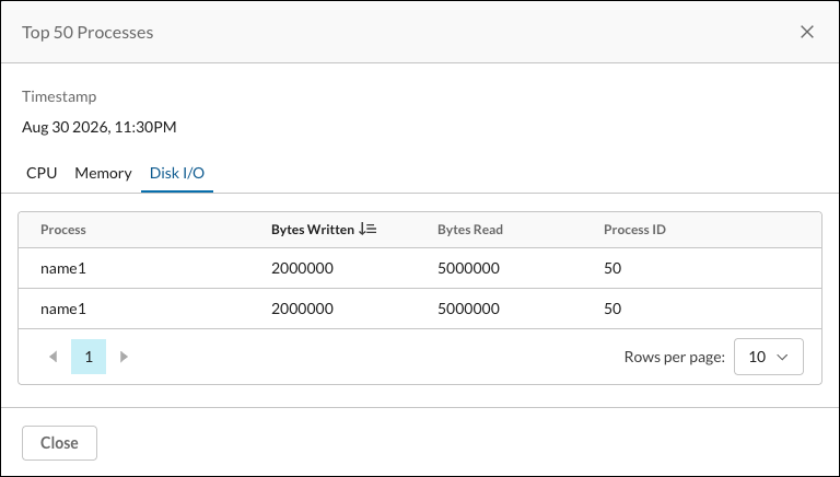
- Disk I/O: This tab displays a list of the process, bytes written, bytes read, and process ID.
- CPU: This tab displays a list of the process, CPU %, threads, and process ID.
Network Throughput
The Network Throughput metric displays the observed network throughput in the set time range for the selected user and device. You can view the sent bytes and received bytes by hovering over a data point.

Disk I/O Rate
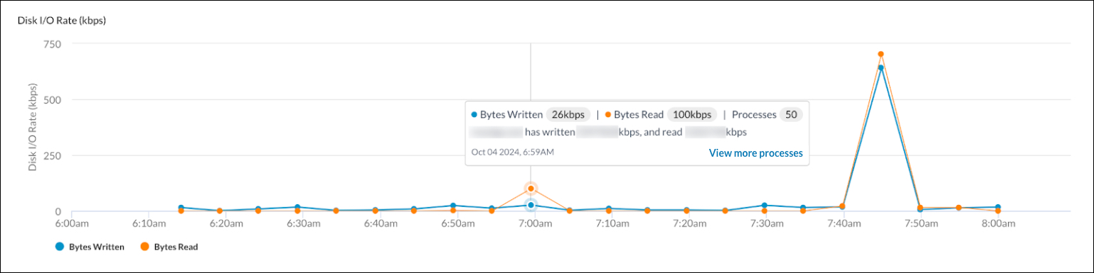
The Disk I/O Rate metric displays the observed disk input/output rate in the set time range for the selected user and device. You can hover over a data point to view information about the bytes written, bytes read, and processes. You can also click View more processes to view additional information, to learn more, please see the Process Info section.
Battery

The Battery metric provides information about the battery level for the selected user’s device at a specific point in time.
Wifi Signal Strength
The Wifi Signal Strength metric provides information about the wifi signal strength for the selected user’s device at a specific point in time.

Network Events – Device Events
The Network Events – Device Events metric displays data on any device or network specific events that may have occurred during the set time range such as logons, logoffs, or network disconnections.

Netskope Metrics
Processing Time
The Processing Time metric provides a measurement of the average time it takes for Netskope to process your traffic at any POP used by your organization. The data shows the average latency observed per minute, based on the traffic (including both requests and responses) processed at the last connected POP. The traffic for this measurement is selected through a process of random sampling each minute.

Transit Time
The Transit Time corresponds to the total time spent within the Netskope infrastructure. It includes the time spent in the NSProxy to forward the request from the NSClient to the application server, added to the time spent in the NSProxy to forward the response from the application server back to the NSClient.

Application Metrics
Important
The Application Metrics are displayed after you have selected an application under the Monitored Applications section.
Round Trip Time
The observed Round Trip Time (RTT) for the user connecting through the connected Netskope POP to the monitored application.

TCP Connection Time, SSL Handshake Time
The TCP Connection Time SSL Handshake Time metrics correspond to the time needed for the NSProxy to securely connect to the application server. This includes the TCP as well as SSL/TLS handshake processes. The Redirect count provides the number of redirections that have been observed during the select timeframe. The Connection time from the Netskope POPs to Applications section corresponds to the time spent by the NSProxy to establish a TCP connection with the targeted server. The “TLS” time from the Netskope POPs to Applications section corresponds to the time spent by the NSProxy to perform the TLS handshake process with the targeted server.

In case of redirections, this value corresponds to the sum of all occurrences during these redirections.
Server Response Time
The Server Response Time metric displays the time between the first byte of NSProxy request to the application server and the first byte of response received by the NSProxy. This Server time is the main server performance indicator, as it mainly takes the server processing time into account.

In case of redirections, this value corresponds to the sum of all occurrences during these redirections.
Advanced Wi-Fi
The Advanced Wi-Fi section on the Saas/Custom application tab shows the Wi-Fi score for users. Hover over the session to see the score for a specific point in time. Click the down arrow to Export a CSV file with this data
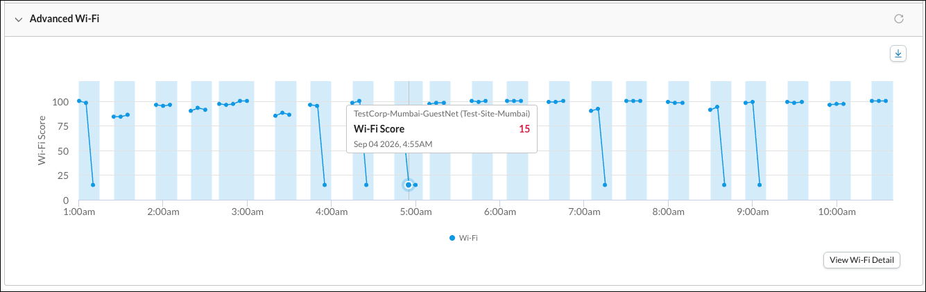
Click View Wi-Fi Details to open this window.
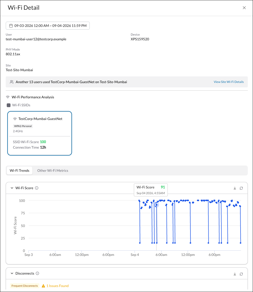
This page displays the Wi-Fi Trends and other Wi-Fi Metrics.
- Wi-Fi Score: A 0–100 score for this device’s Wi-Fi quality on this network, based on signal strength and connection stability. Drops further when an issue is detected. Click the down arrow to Export a CSV file with this data.
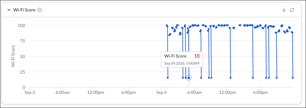
To learn more about how scores are calculated, see How DEM User Experience Scores are Calculated.
For a more granular view, use your mouse to highlight and expand the chart to show more incremental time periods.
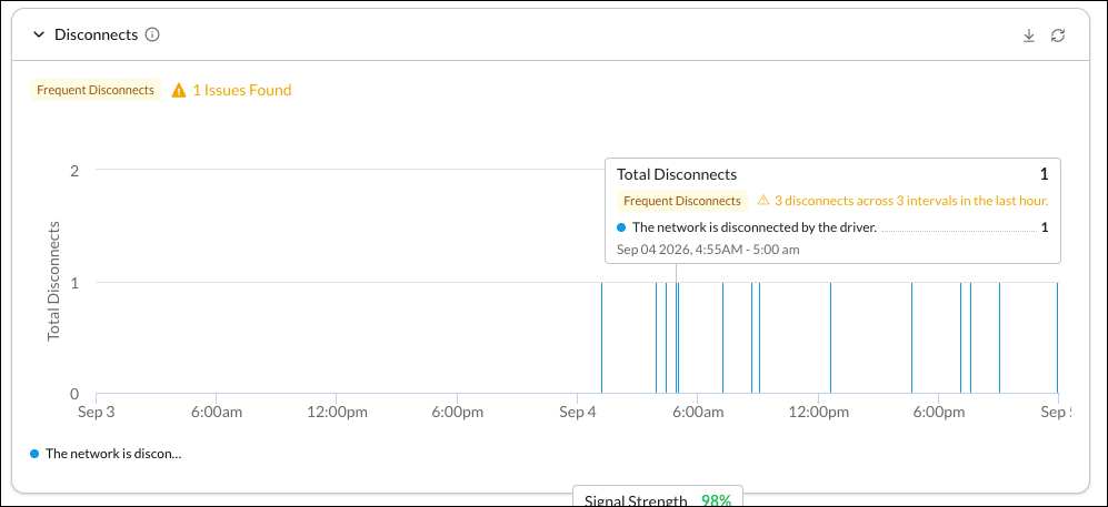
- Disconnects: This device disconnects per 5-minute window, broken down by reason. Flagged as an issue if disconnect was observed in 3+ windows in the past hour, or 3 new windows since the last issue. Only Windows devices include Reason codes and exclude user-initiated disconnects. Click the down arrow to Export a CSV file with this data.
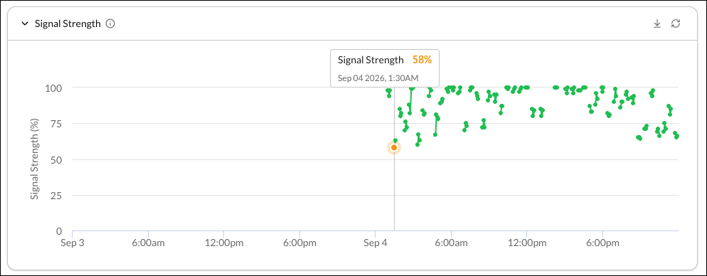
- Signal Strength: This device’s Wi-Fi signal strength over time. Flagged as an issue when signal drops to 30% or below. Click the down arrow to Export a CSV file with this data.
- Send/Receive Rate: This device’s Wi-Fi upload and download speeds over time, in Mbps. Each point is a 5-minute average. Click the down arrow to Export a CSV file with this data.
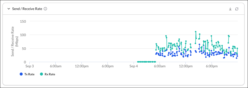
- Roaming: Tracks this device’s switching between access points (roaming) on this network. Flags a bad roam when signal quality drops from Good (>60%) to Bad (<30%). On Windows, Location Services must be turned on to detect this.
Review the Other Wi-Fi Metrics section:

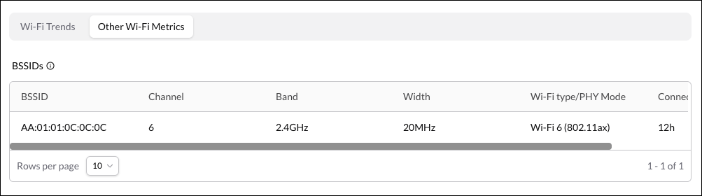
BSSIDs: Lists every access point (BSSID) users have connected to on the network, plus the Channel, Band, Width, Wi-Fi Type, and Connection time.